You may have noticed that the styles you added in the previous step select any <rating-element> on the page as well as any <button>. This can result in the styles leaking out of the element and selecting other nodes that you may not intend to style. And styles outside of your custom element may unintentionally style the nodes inside the element.
For example, try putting a style tag in the head of the main document:
Your output should have a red border box around the span for the rating. This is a trivial case, but the lack of DOM encapsulation may result in larger problems for more complex applications. This is where shadow DOM comes in.
Now the red border box should be gone—the styles in the main document can no longer select the nodes inside the shadow root.
How did you do this? In the connectedCallback you called this.attachShadow which attaches a shadow root to an element. The open mode means that the shadow content is inspectable and makes the shadow root accessible via this.shadowRoot as well. Take a look at the web component in the Chrome inspector as well:
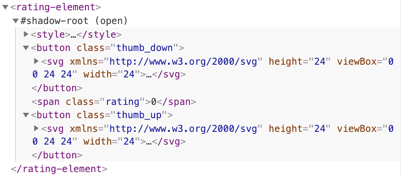
You should now see a shadow root inside your component. You can expand the shadow root to show the contents of the shadow DOM. If you select the rating element in Chrome Dev Tools and call $0.children, you'll notice that it returns no children. The shadow DOM is its own DOM tree, separate from the component's direct children.
Once the page refreshes, you'll see that the new <div> does not show up. This is because shadow DOM has features to control how child nodes—sometimes called light DOM—are rendered or projected into the shadow DOM.